though i have enjoyed the last 4 years (6 years counting art in sixth form) in creative education, i would like to take the time to open myself up to other experiences i haven't yet had such as traveling to different places and culture before i go straight into a working routine. i hope by taking a step back by passion for the subject (illustrating will become more obvious to me (i feel it has become a choir recently) and by experiencing different places will hopefully inspire my creative thinking.
me and my friend have planed our route of travel for this July and August around Europe:
Prague
Krakow
Budapest
Slovenia
Croatia

Showing posts with label OUIL502 studio brief 3. Show all posts
Showing posts with label OUIL502 studio brief 3. Show all posts
Monday, 29 February 2016
Monday, 18 May 2015
final promo pack
links to online presence
http://pigeonwithapencil.tumblr.com
https://www.facebook.com/REW.illustration?ref=hl
http://pigeonwithapencil.tumblr.com
https://www.facebook.com/REW.illustration?ref=hl
Sunday, 17 May 2015
OUIL502 PPP module evaluation
I found this years PPP has been really beneficial
in my development as an illustrator in terms of branding and the industry
itself. It has definitely addressed the key concerns of mine that I have
perhaps been to scared or ignorant to think about, like the big question of ‘what
happens after I graduate?’ though at times I found the PPP sessions quite confusing
and theoretical, especially learning about service sectors and creative
industry, I appreciate that this is an important part of business.
I
have found the weekly session with John very helpful and have learnt a great
deal about self-promotion and things to look out for when dealing with a client
such as copy write, legislation, pricing of work. Though I could not of asked for better
advice, I still struggled with the idea of defining my practice in the form of
a promo pack, let alone defining myself! I am a very indecisive and hesitant person,
which made it difficult for me to come up with new work to visually communicate
myself or choose from my existing work to do so.
However I persisted and focused on myself
as an illustrator and a person, which allowed me to figure out what message I
want my promo pack to communicate about myself. This process has made me still
back and think about design style and
where I feel my strengths lie, something I should do more often as it has
allowed me to focus and develop on what works and what does not.
I feel content with my promo pack that is represents
me, as a person and as a creative.
Because I am dyslexic, I find it hard to
communicate myself well which does not help my confidence, something which I
feel hold me back from branching out and talking to people about my work,
especially professionals as I do not want to appear stupid. Thankfully, the
main thing I taken from this module, especially creative presence is
confidence. I feel a lot more confident to approach others or contact professionals
now I have learnt how to deliver questions and myself appropriately. I also
feel reassured that this is hard for everyone and you have to start somewhere! I
plan to start with emails, which will hopefully allow me to build a
relationship up with clients or professionals which will with any luck make me
feel more relaxed when meeting them or talking to them on the phone.
I have also set up a number of social media
sites presenting my work, something I would have been to embarrassed to do last
year due to lack of confidence in my work especially with such strong competition.
The feedback and comments I have got of the back of these has given me more
faith in my work, encouraging me to keep it up!
I feel I can now call myself an
illustrator, though I obviously illustrated in first year I still felt unsure
about what an ‘illustrator’ does and how they become successful In their profession.
I feel I have grown up from last year, when
discussing ideas and the industry with peers and tutors I feel more like a
practitioner rather than a student.
I am clearer of how to persist in a career
in illustration whereas I felt clueless about this in first year, which was one
of my main concerns, before, I new I loved to illustrate but was unsure how my
skills could be put towards a potential career.
I think a strength of mine this year it
that I have made a point in blogging each lecture we have been given, which
allows me to go back and remember key points about branding, and the industry etc
I will need to know for future reference.
I think my main weakness within creative strategy
and my work ethic, as a whole is not getting someone to proof read my work before
printing. Annoyingly I always find one mistake I miss no matter how many times
I proof read. This cost me in money but also vital time.
With my promo pack, I wish I has experimented
or revised the paper stock before printing as I feel the paper I have printed
my creative cv (the pack) onto is not idea for transportation as I t It marks
very, very easily resulting in the pack looking grubby, especially with it being
a white background.
I feel the most
vital thing I have taken from this year is to drop the attitude that work will
come to me when I finish uni, I now no it is all down to me branding and getting
myself out there for potential clients to see. This is something I need to be working
on from now onwards!
choosing to re-print promo pack net
though i have already printed my promo pack 2's, i have decided to print it again as there are a few things i am really not happy with which i do not want to get marked down for, or if i was to send it to a client, these mistakes stop them from contacting me.
mistakes and things i want to change:
...
though i make sure to print my promo pack in good time, Thursday 14th of may leaving myself 3 and a half days to reflect on the production and to see if i could improve, i did not consider that the days i could re-print would only be Monday morning, the day of my deadline.
so....i am currently sat in the Que outside the digital print room, fingers crossed i can print in the drop in times!
UNFORTUNATELY….
i was unable to print my pack off before drop in ended at 10am. this was really frustrating as i was next in the que and only had one thing to print out, especially seen at though i got there at 8.
though i did feel organised with this module, printing off a few days before my deadline, i have let myself down with professionalism and proof reading. - I'm really frustrated at myself.
mistakes and things i want to change:
- the paper stock- though it was the right thickness, it was prone to marking easily, which made my pack look grubby especially with it being white.
- to avoid grubbiness further - i have changed the majority of the background colour to the light grey i used on the inside flaps.
 |
| improved net |
- still found one spelling mistake! - i have spelt the word entire wrong on the first information flap.
- i found folding my promo pack quite difficult which i think has resuted in my pack looking worn through constant bending. hopefully, now i have experimented with folding it 2's i will no the best technique.
- weirdly, the arm of the figure on the front of my promo pack was cut off slightly, though the person receiving my promo pack would not no this wasn't right, i think it is much more effective when the figure is more towards the centre as you get the full impact of the drawing.
...
though i make sure to print my promo pack in good time, Thursday 14th of may leaving myself 3 and a half days to reflect on the production and to see if i could improve, i did not consider that the days i could re-print would only be Monday morning, the day of my deadline.
so....i am currently sat in the Que outside the digital print room, fingers crossed i can print in the drop in times!
UNFORTUNATELY….
i was unable to print my pack off before drop in ended at 10am. this was really frustrating as i was next in the que and only had one thing to print out, especially seen at though i got there at 8.
though i did feel organised with this module, printing off a few days before my deadline, i have let myself down with professionalism and proof reading. - I'm really frustrated at myself.
Saturday, 16 May 2015
visual headers
 |
| for the format i had to work with, i feel this design layout works much better as i don't have to sacrifice a part of my body unlike the designs above. i also think the piece above have too much negative space going spare and would be more appropriate for a portrait ad. |


Friday, 15 May 2015


problems when printing

when folded, the flaps did not fit together so the sticker wouldn't be able to hold the paper shut
 |
| spelling mistakes -inter instead or entire |
 |
| works split on 2 lines - does not look professional and makes it hard to read. |


Sunday, 10 May 2015
final decision on Business cards
i asked my peers for advice on what the felt was the most successful layout of my buisness cards.
Robyn felt that the design where my body was split up, showing my legs at the top and head at the bottom could be discounted as i have already shown this idea in my promo pack.
i agree with robyn about loosing this idea, epically after printing the card at actual size as the wealthy and detail of the picture was lost sue to how small the drawing would be.


from the above, robyn preferred the design without the grey background. initially before printing i preferred with the grey as i felt the card would have to much white space. however when i have printed them out, because the cards are small, the white does not look overpowering and actually allows the drawing to take focal point unlike the card with the grey colour which becomes a distraction.
however she did mention that she felt i should change the text at the top of the front of the card (above the head) from my Facebook link to my brand name. i have done this below.


trying out landscape...


creative cv information
Education:
Leeds College of Art
September
2013 to present
-BA (Hons)
Illustration
Kendal college – Art Design and Media
September
2012 – June 2013
Art And
Design Foundation Diploma
Distinction
gained
Kirkbie Kendal School
September
2010 – July 2012
A-levels
Art – A*
, Graphic Design - B, Media – C
Kirkbie Kendal School
September
2005- July 2010
GCSE
10 grades
A - C
Creative
Skills:
·
Attention to detail
·
Appreciation of realism
·
Collaboration of medias
· Keen learner
· Computer skills
· Adobe Creative suite skills.
· Attentive with layout and composition
Attributes:
•
Punctual
• Good time management
• Creative problem solver
• Approachable
• Good communication skills
• Responsible
• Team player
• Research and Development
interests:
Within my practice I enjoy
creating detailed work about people or subjects that have a profound story
behind them, I like to convey deeper meanings within my work to illustrate a
stronger thought-provoking concept by gathering substantial research to gain a better
understanding. I hope that by exploring subjects intently, my illustrations
will express my empathy towards the matter and justify them.
When I am not enthralled in
my illustrations, you would usually find me with my other passions in life;
friends, family, walking (to the fridge), traveling and singing in the shower –
a daily ritual.
I first realized a creative
career was for me at 7 after spending my inter first holiday abroad
illustrating our daily adventures – my mum was not amused with the drawing of
her falling out of the dingy…
Profile:
I am a self-motivated
perfectionist who always aspires to work to the best of my abilities. I am both
organized and punctual with my work commitments expressing my enthusiastic and
driven personality. Although I usually work independently, I am not afraid to
throw myself into collaborative work to challenge my creativity and learn new
skills. I consider myself a very reliable and responsible individual who is
friendly and approachable.
Work Experience:
Lighthouse Café restaurant –June 2014 - September 2014 and June 2013 - September 2013
Responsibilities: serving
customers, handling money, food preparation, cleaning
Topshop - September 2010 -
September 2013
Responsibilities: Customer service, manning the tills, handling deliveries, creative
visual merchandising, painting displays.
Contact:
Rebecca Williamson
1 Thompson Fold Lupton Carnforth,
LA6 2PP
07711062213
postcards
below are the postcard designs i want to add to my promo pack. i chose these as i thought together they show a good variety of my skills.


Saturday, 9 May 2015


final self branding illustration
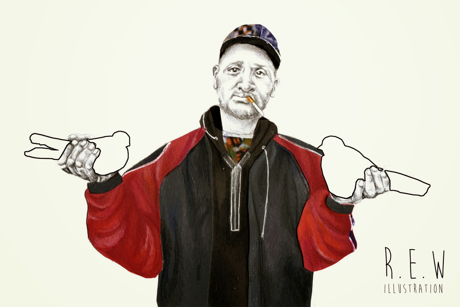
one reason i decided to draw myself for my creative presence was to give the client a subtle reminder of my appearance, which will hopefully trigger there memory of my work or potential meeting we have.  |
| i found drawing myself a very weird thing to do, and quite a challenge as i was unsure weather i would catch my likeness or capture how i look to other people. I'm glad that i decided on a unposed picture as it makes the illustration more natural. i wanted to capture traits about myself in the illustration so wore my casual clothes, and stood in a stance i would do naturally - i hope this will connote to clients my approachable personality. if i have time, i would like the experiment with adding background illustrations symbolising me as a person and my practice - e.g pencils, camera, building in leeds, etc which will show through the negative space of my clothing. like the technique below.  |
Friday, 8 May 2015
A.I.M


today i went down to support my friend at her collaborative event AIM. this was really good to see how other courses have produced worked together like we have had to do our course.
robyn and her group have created there own brand for this event and have used merchandise to form a strong brand identity such as t-shirts, posters, badgers, flyers, key rings and a website all with the brand name and logo on. this was inspiring and influential to see how successful branding can be in creating a memorable brand and therefore a memorable event.
Subscribe to:
Comments (Atom)