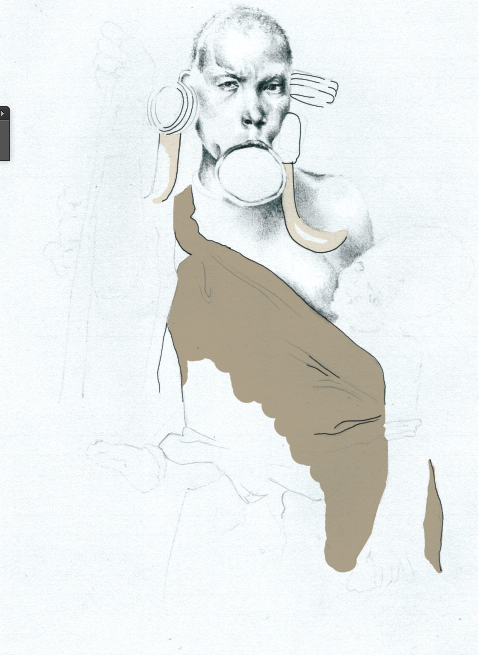
recently i have used photoshop to improve the quality of my work and add collage colour to my line work e.g.-
i think by doing so, my work has more of a professional aesthetic to it.
Judith Van den hoek
I think this piece diary Judith van den hoek, is really effective, I like the fact the colour added is it really smooths, the same shade/colour throughout, which sometimes quite hard to achieve when adding colour by hand. I really like the sketchy approach to adding the colour, the shape of the clothes have not been completely filled with the colour achieving then finished faded-out look i like - By adding a section of colour to the shape of the clothes give you the guidance and impression of the T-shirt and allows you to fill the rest in for yourself.
however one thing I would change about this illustrators piece is the colours used, I feel the grey background in combination with the grey T-shirt and great shades of the face are a bit to dull, I think another colour would have been nice to make the illustration more prominent.
adding line by hand to the clothing.
Adding the colour- I feel this example is too contrasting of the detailed pencil and the block colour. 

For this experiment, I used the multiply layer when adding the colour so the detail from the drawing showed through the colour, creating texture to the clothes and subtly combining the pencil drawing and the digitally added colour. however I still felt the pen lines used to draw the clothes were not bold enough and therefore the colour added still looked random and contrasting/bold next to the drawing.
using a brush pen to outline and add detail to the garment.
I think these pieces work better in combination with the pencil. I prefer the duller colours added to the garments and jewellery/ objects, as I think it makes the piece more subtle and calm. however I'm still not 100% sure that the grey, delicate, subtle, light pen work works next to a stronger prominent black pen work and colour.


No comments:
Post a Comment