Friday, 27 March 2015

picking up Business card


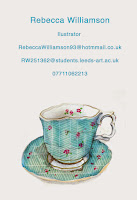
I went to a arts fair and came across this business card designs. Though the illustrator hasn't given much away in terms of her abilities as a illustrator, I still think it is a effective business card as it deliveres a simple message and you can clearly identify her business name and therefore it will be rememberable. 
I think the way she has added the social media icons is a visually clever way to connect to the tech savvy generation, as it doesn't bore them with information (ie, Twitter name: instagram name) the icons for this for you. 

Monday, 23 March 2015

How do i make my identity work for me?
what i produce must convey who i am
my ability
personilities
eargerness to work with the client

aim to show talent visually, but show this in text too - possible collaboration with my friend Harriet
( a creative writing student.)

make people aware you exisiste
showcase yourself


to become a 'player' within the industry one needs to communicate with peers

YOU WILL ONLY GET OUT OF THIS WAHT YOU PUT IN.

ones identified by other illustrators, as on going investigation, how can you make contact - email, phone.

LOOK AT :

  • cargo collective 
  • Art Box 

platforms to get work out there.

contacting and talking to professionals

before you contact!
  • know in your head why you are contacting them
  • write down what you want to cover in the discussion 
what do you want to tell them and find out?
  • you exsiste 
  • advice, feedback on work, technique, working strategies?
  • how and where they create there work
  • what type of illustrator i am 
  • what work do they see as syergetic 
  • is our work simular....
what can i show them?

  • A brief?
  • creative cv?
  • work your happy with 
  • promo pack?
what you should take away from the contact

  • experience - confidence in doing it more and more
  • insight in to how others work 
  • their contacts! - networking!
  • synergetic mix
  • feedback/advice 
  • chance to go back and talk again
who do you know :-
why would you want to know them
remember that professionals/illustrators you contact like to answer questions
they want to pass on their experiences.

DONT ASK TOO MUCH
keep it simple
'what do you feel is your most successful work?'
'is drawing still important in the digital age?'

Networking can last for years!
  • you will get people who want to change your style 
  • different advice
GO WITH YOUR HEART- but opinion and advice is important but not a instruction. 

Monday, 16 March 2015

16th march -copy right

finding work very simular to yours -
they will  deny all knowledge that they have e copied your work

how do you copy right your work?
soon as you produce it its yours
noone can claim its theres unless they have signed copyright assigned.

never breach a copy right
just because it doesn't have a copyright symbol doesn't mean its free to use.

why bother?
isn't  everything on the internet in the public domain and can be used?
no.
only work where the copy right it expired or has been assigned, created by the government, and has been assigned into the 'public domain'

70 years from your lifetime copyright expires.

things that are not covered by copyright
ideas, facts, concepts.

DONT BACK DOWN ON THINGS- become a rash they can't get rid of.

hang on to original work.

licensing your work
if you are asked to license work i.e a stock illustration/image/design on which you may wish to retain the copyright. 


you can limit the license you allow to that single use.

what clients do say: if i paid for the work i must own it?
if you are happy to assign the copy right you can at any given time. however dont give it straight away. 
'i will a-sign copy right at full and final payment' - also suggests they can't use until they pay you. 

how do you make client aware of terms and conditions?
all work will be estimated to owe client and will only commence work on the full acceptance of said estimate. 
all deadlines will be adhered to and you will be contacted in those rare see that may delate any progress.
a new' client' will be expected to pay a deposit of 50% prior to commencement and full balance on supply of final files'
all payments will be transacted by bank...

getting your commercial ducks in a row.
  • when  you get the initial capp from the client discuss the content and estimate first.
  • explain you need 50% upfront
  • any additional work will be charged x amount a hour. 
  • ask for purchase order.

if they do not agree or send the order you have lost NOTHING yet. 

dont ring the client if you havent been paid- ring the accounts department.


Sunday, 15 March 2015

applying existing work to business cards.


as this module and personal branding/creative presence is just about you  showcasing yourself as a illustrator i played around with using my existing work instead of creating new illustrations would would take extra time and may not be as strong or show my skills aswell as work i already have.
i really enjoyed seeing my work being put into different formats (business card) i have experimented with duplicating images to make a more interesting card design. 

although i found adding my illustrations fun and straight forward to do, i definitely need help/advice on fonts and layouts. ^This is not ok! it really brings the effect of the illustrations down aswell!. 

Sunday, 8 March 2015

tetley book fair


the tetley book fair showcased a variety of artists who all share the passion of book making, there was a mixture of  unique and handmade books to print-on-demand publications. informal and intimate books, to  complex and surprising books. The fair showcased new work including limited edition books produced especially for the event. over 50 exhibitors from across the UK and beyond took part in the fair, it  is one of the most established and largest in the country. 
it was really cool too see how diverse the content of each book could be, yet they all are created and can exists in the same format.  

as i enjoyed the 405 module where we were required to make a book, after being inspired by the book fair, i aim to create another for my 505 brief, hopefully this time, from visiting the book fair and researching further into book making, my book will be influenced and more professional. 

Lina Avramidon- book arts and binding
Rebecca Feneley- Illustrator
Elizabeth Shorrock- mixed media art and handmade books

Monday, 2 March 2015

buisness card inspiration

Using negative space
speaking to john he mentioned how some creatives just add work and/or text to one side of there business card, leaving the back blank allowing clients to jot down notes about you, e.t.c . this influenced me to think about design layouts that would give me enough space on the front of the business card to add an illustration and text. 


Playing around with using my existing work on a buisness card


i really like how this illustration flows onto the back of the business card - almost like a guide , leading the client to the back of the card where they can take note of my contract information. 


creative cv ideas

i think this is a really good idea- dedicating a whole page(back) to visually communicating my identity that is described in writing with my cv. it allows the reader to focus on the info without getting distracted. however does this take away from the fact that i am trying to create a creative cv without involving creativity in with the writing?

invovling the creativity among the writing- though this is involved with the writing, i like how the 2 are separate and therefore the reader can read the info clearly. 

making the cv not look like paperwork. - from my own point of view, i find when i am presented with  a written document, i loose interest fairly quickly and find it hard to take information in (usually understand better if its visually presented to me!) so in that way, i think using different fonts, images, drawings to communicate the information makes the document look more fun and a piece of art rather than a piece of writing!


other ways of making my cv not look like a document. i like the way this person has drawn a portrait of herself to go with her portrait, in the same way a photograph would, this will jog the readers memory of who's the cv is, but i a creative manner. very clever. at first glance at this cv, a recipe layout instantly spang to my mind. this made me think of perhaps using the concept of a recipe to communicate myself- each section explained (qualifications, statement, skills etc) is a ingredient that makes up my identity. 


creative presence inspiration, and contextual references

Follow Rebecca's board creative presence (ppp) on Pinterest.

ppp-2nd march.


MOLLY CRABAPPLE- ILLUSTRATOR 
  • how life has informed/influence her work


dont always have to operate under your own name- can create a name (remembrable)

the guardian- professional illustrators.  

do ppp mock up promo cards!
OR any promotional wear to jog someones memory. 

is it important to leave the back white - gives space to write on 


jackson pollic 

just cos we are creatives doesnt mean we can’t have terms and conditions.- pricing, legal problems. 

invoicing

decide how you can get your personality, creativity, product out there. 

evaluate research you have collected (pinkest, tumblr etc) and see where your interest seem to lie.

how do you decide how to price your work
 - depends how intensive your work is.- the thought behind it, 
make sure you get these things upfront before starting, agree the price, tell them how you want to get paid. 50% up front,50% on completion - so no one ends up upset! - me or the person who has given me the brief.  first thing you should ask - do you have a budget to this? negotiation. DONT START CHEAP, as they will use you again and again and you then can’t ask for more. 
NEED A PURCHASE ORDER-ask for this. accounts department are your best friend if you have this. 
use copyright so you own it before they pay you.

good thing about email- dated and time stamp. 


KNOWING WHEN TO STOP- 


correlation between doing something you love and being able to live. 

if you put anything on bechance- make sure you put a copy right symbol.

circumvent everything at the begining so it doesn’t bite you after. 

dont try to be professional ( on tumblr, pinterest) someone who might see some of your ‘crap’ work and like that more.  

£25-30 a hour?

semore s
knuckle glazor, - 

identity can chance- can be anything - whatever floats your boat.
serious, funny, political -JUST GET YOUR PERSONALITY OUT THERE. 
i dont nescessesary know what genre of illustration i fit into (commercial, editrorial, reportage, narrative) 
DONT NEED TO. just use it as something to draw them in. something creative to look at. 
illustrator with a ‘sense or humour’ 'that cares’

DRIBBBLE - identity name. 


WILL-I-AM

REBECCA WILL 

open a dictionary and look for a word.

TASK ONE - Creative presence


what should your identity cover about you?
i want my identity to show that I'm delicate/pay attention to detail into briefs i have been ask to complete. i want it to coney my tone of voice so people can see what type of work i am capable of and if i am the right person for the job they want doing.

is it actually important to have a identity as a illustrator?
after taling to john about my worries of not actually knowing what type of illustrator i am and why type of issues i like to illustrate (political, humorous, editorial, commercial etc) he assured me that you identity can be anything. whatever floats your boat, makes you you. it can change. if your more serious, do a serious identity, if your work is funny, illustrate a funny identity. - JUST GET YOUR PERSONALITY OUT THERE.
however i do think it is very important to set yourself apart from others, be it by my tone of voice, or the type of things i like to create with my chosen style.

what could be included in your pack and why?
business cards - with appropriate contact info
postcards
online presence - so people can see the broader range of things i have do and I'm capable of doing
creative cv - for me to communicate myself for people to understand me and my work as a person and a creative.
bookmarks- a way of advertising and making people remember my work.
pen pots. (stationary)- promotional - keep it in a context of creativity.
magnets - memorable burst - every time they go to the fridge they will be reminded of my work.
Small prints.
these could all be contained or presented in a box, (promotional pack)

what are you wanting to achieve by producing promotional items?
i feel this will allow me to in-visage how my work can be outputted in a commercial and promotional style which will not only allow me to think about how to make work for these context and in a professional manner, but will also allow others to see my work and think of me as a professional.

Sunday, 1 March 2015

inspiration for promotional cards


i think a main selling point to a successful business card will be that it easily visualises our identity and separates us from others and something that can represent someone as a whole. in this module i will aim to create a business card that shows my individuality.
making the card simple will also allow me to establish a brand identity which i can use elsewhere and can be applied to a variety of products (such a online presence) and create a stronger brand identity.

i really like the simplicity of these cards. they focus on the illustration and the illustration alone. i think this is a ideal method for when i design my business card as my illustrations are quite detail and therefore more detail (info ) will make the card overcrowded.