

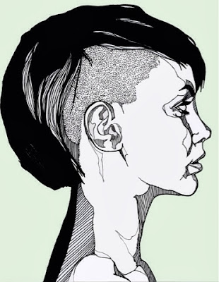
i like how he has used lines to represent shadow instead of showing gradual shading. i also like how he using lined shapes around the eyes and cheeks which represent areas of mid tones.
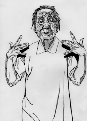 though this image uses the same lines and shadow technique, i think this illustration is a bit too bold and uses dark lines which kind of over powers certain areas - e.g. the face is a bit to overcomplicated and over worked- i think if the line work was slightly lighter or more subtle on the face the piece would look more delicate and in my opinion more effective.
adding colour- i like how he has used colour to fill in the shapes he has created with the lines. the colours he has used here are very bold and make the illustration very striking. i think the exaggerated colours he uses to represent the facial colours are very daring but make the illustration interesting. i like how from far way the colours merge together and then block colours inside the lines are not obvious.
i want to experiment with adding digital colour to my work, however i am unsure weather this bold style would suit the more delicate work i tend to make. i plan to experiment with adding colour and how to add colour effectively in the further.
No comments:
Post a Comment