- he uses photos to draw from- takes he's own references images to get a accurate view of what he is trying to create.
- one of the most important things in he's work is finding quality reference material.
- 'everything is art'- showed is some pictures of painted walls that have different blocks of colour painted on them to cover up graffiti.
- everything you see is art- pavements with shapes in etc
- mistakes are art.
- sometimes the most simple ideas are the ones that make a commercial success- e.g. he's drawings of just hair, no heads. amy winehouse commission.
- 'all companies want to be funny'
- high risk strategies are sometimes good to use to get noticed.

Friday, 24 January 2014
visiting lecturers - Mr Bingo
key advise/ info i found out from he's talk:
Sunday, 19 January 2014

Friday, 17 January 2014
Lucinda Rodgers

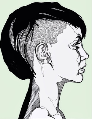
i really like how this illustrator uses different width lines to give the impression of depth -shadow and highlighted areas. i feel it makes the objects more prominent against the white of the page.
though, myself, i have always been one for shading and tonal work to show shadow areas and highlights, i am surprised that i find this piece just as impressive without it. i like how she has just used line to outline words to give them definition and to show mid tones, and has used block blacks to show the darkest tones in the drawings
though i think this is a effective piece of work in monochrome, i would be tempted to add a subtle amount of colour just to give a impression/hint to the colours that make up the objects - such as a little bit of yellow inside the lemons.

Tuesday, 14 January 2014
Time management workshop 2


As a group we had to list all the social, academic, and domestic things we listed on our individual sheets of what we have to do in the next 3 weeks.

Then each group put each list on the way at the front. As a class we discussed some of the things and added some to our own list which we had perhaps missed out but also do. 
Then as a class, we disscussed distractions we have that prevent us from doing these things.

After this we went back to our groups and listed rules that we would give our selves over the next 2 weeks that will hopfully improve our time management.
Monday, 13 January 2014

Sunday, 12 January 2014


Tuesday, 7 January 2014
Michelle Morin
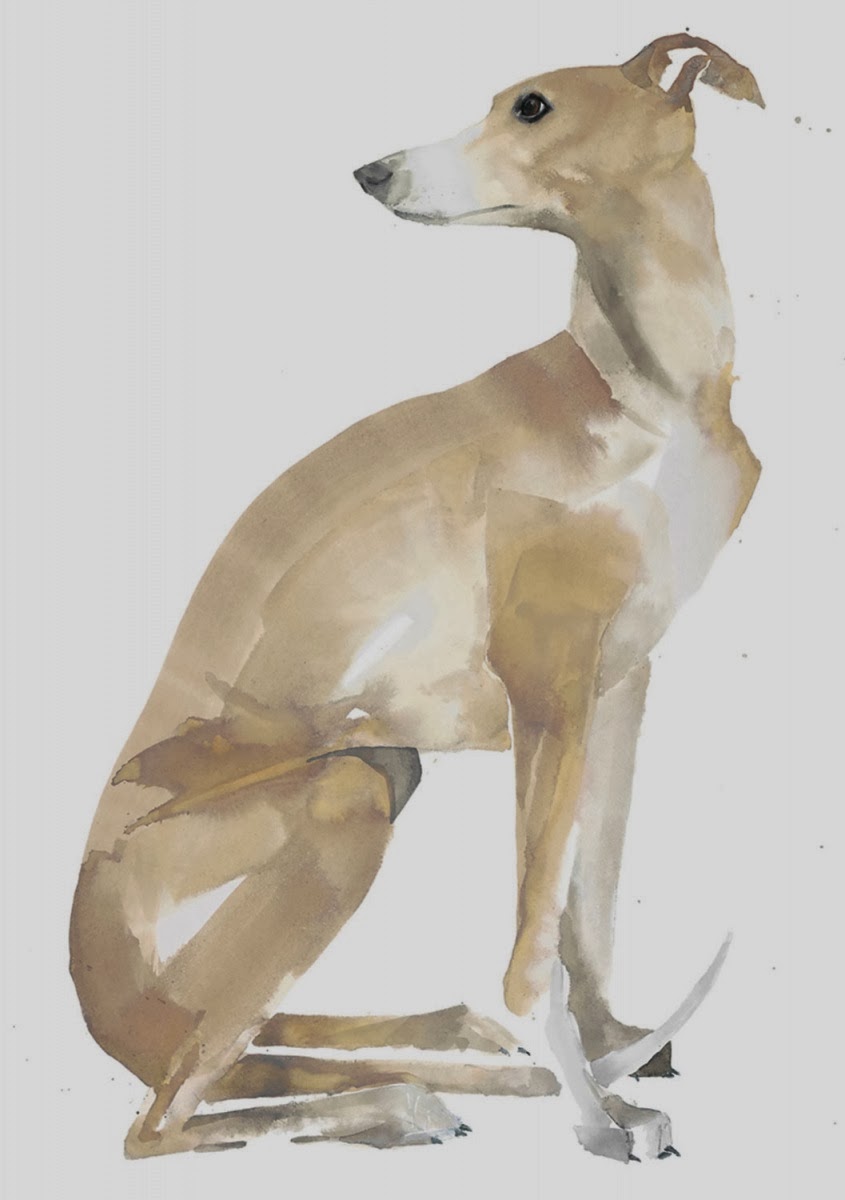 like sarah maycocks dog, i really like how Michelle Morin creates a wash of watercolour in a simple shapes to represent the whales, but by adding darker shades to shadow areas and important areas that need detail the whales becomes more recognisable and delicate. i like how detail is only added to important focal points, and the rest of the image relies on the simple water colour shape outline to describe the rest of the whales shape, i feel if the same level of detail was applied to the whole the visual quality would not be the same.
those these are not photo realistic i think there are just as effective.
the colours used in this pieces are all from a similar colour pallet so fit together nicely and subtly.

though i feel this style works brilliantly on animals, from testing out this technique myself using human form reference, i found it difficult to decide which areas where the most important to focus on on the human and add the detail and which to leave up to the wash to provide the impression of the figure as i feel the human form has a lot more aspects that need to be shown to show their likeness. e.g.- i found i couldn't just draw the eyes without drawing the mouth and lips in the same detail.

time management workshop
this morning we were set a activity to workout how much of our time is used divided into 3 categories:-
academic
social
domestic
we had to list as many things we new we had to do in these next 3 weeks and place them into each category.
and then with these answers, we were given a new sheet were we had to give a general time it takes for each of these activities to be done.
fred wanted to to review this and see if there was a better way we could manage our time and cut out certain activities.
indesign workshop how to setup printing a book
Learning how to set up a new document -
thinking about the bleed/crop marks : if i wanted to print a a4 book up to the edge of the page i would have to print it out on a3 and cut down so i would not loose any image. allow usually 3mm for bleed.
16 pages saddle stitch- must be a multiple of 4 and a even number.
facing pages- use that when we are creating books.
pages palet- over view of whole document
readers spreads- appear on screen as the book will be once its printed and bound- give you a better visual of what your book will look like. easier to arrange book.
editing text- use type tool
to move around text- select container and move
must be aware that if i am creating a double page image, the pages will not be printed next to each other, therefore i must work out which pages i need to draw the image onto which will sit next to each other when the book is put together.
e.g
left right
8 1 1 piece
2 7 of paper this is also applicable in the hand binding
6 3 2 piece method
4 5 of paper
the number on each line always add up to one more than the amount of pages in your book.
file- print booklet
booklet type- saddle stitch, perfect bind, consecutive
2 up- 2 pages text to each other
print settings- standard adobe indesign print dialogue box
general- print blank pages- eg contents pages which are blank, that you still want to be printed
setup - specify printer ,paper, orientation, scale, page position-should always be set as centred
marks and bleed- 3mm, add crop marks to show us where to trim page down too.
perfect bind
- separate single sheets. tick print blank pages
setup- centered
marks and bleeds- crop marks, 3mm bleed
printer- two-sided : long-edge binding
concertina bind
general- speads, ranges:2-7
setup- centered
marks and bleeds- crop marks, 3mm bleed
double page spread- just spread image across both pages and indesign will spilt it for you when printing.
image spread across 4 or five different pages????
photoshop:
resolution 300dpi
actual size
if colour image:cmyk mode
or grey scale
save as either TIFF file or a PHOTOSHOP file.
Monday, 6 January 2014
Luke Dixon

i like how he has used lines to represent shadow instead of showing gradual shading. i also like how he using lined shapes around the eyes and cheeks which represent areas of mid tones.
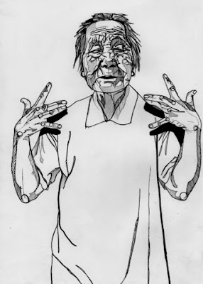 though this image uses the same lines and shadow technique, i think this illustration is a bit too bold and uses dark lines which kind of over powers certain areas - e.g. the face is a bit to overcomplicated and over worked- i think if the line work was slightly lighter or more subtle on the face the piece would look more delicate and in my opinion more effective.
adding colour- i like how he has used colour to fill in the shapes he has created with the lines. the colours he has used here are very bold and make the illustration very striking. i think the exaggerated colours he uses to represent the facial colours are very daring but make the illustration interesting. i like how from far way the colours merge together and then block colours inside the lines are not obvious.
i want to experiment with adding digital colour to my work, however i am unsure weather this bold style would suit the more delicate work i tend to make. i plan to experiment with adding colour and how to add colour effectively in the further.
Thursday, 2 January 2014

Judith Van Den Hoek

i first came across this illustrator when researching into artist who use line the line and mark task we were given in visual language. i chose the illustration above as a example of line work- i really like how she has created a recognisable clothing, hand and body shape just by using lines positioned close together and not a outline. i think it is a good example to show how you don't necessarily need to produce a photo-realistic or exact copy of what you are drawing from to make the subject recognisable, it i sometimes more interesting and engaging when a piece allows you to fill in the gaps and make the decision for yourself.

one thing however i do not like about the first illustration is the face and hair area, i feel it makes the piece look too digital. i think a more delicate approach, like this piece above is far more interesting. though Judith has still used the same effective technique or using block spaces to give the impression of clothing, the combination of detail and block colour really provides powerful focal points. i also like how she doesn't use white as a background colour, i think this allows white to be a considered colour which has a effect, rather then something to fill a background. because she hasn't used white in the background she could have used it to show highlights areas on the face and use the grey background to show mid tones, i feel that white on the face is what this piece is lacking. i think it would make the face more prominent if highlighted tones where shown.

linsay lombard


Reading America by Jean Baudrillard as a young post-grad almost a lifetime ago, it felt contemporary and urgent, it’s references topical – “Boy George, Michael Jackson, David Bowie. . . Whereas the idols of the previous generation were explosive figures of sex and pleasure, these new idols pose for everyone the question of the play of difference and their lack of differentiation.” (America, Jean Baudrillard).
The topicality of Baudrillard’s writing – whose main area of inquiry was ‘media’, the image, and the challenge of engaging in a world coded by ‘signs’ and ‘images’ – can also make the work feel dated. Unless you were a Marxist planning a revolutionary utopia, ‘future-proofing’ wasn’t an idea knocking around 80s philosophy departments. Which is why the California Dreaming project by Camberwell Illustration graduate Lindsay Lombard is such a refreshing take on Baudrillard’s thinking.
California Dreaming turns Baudrillard’s America into a handbook, a usable tourist guide to California as seen by Baudrillard. Lombard gives each observation a different treatment, it’s not an exercise in style. The question of the power relationship between text and image – a cross it seems that every illustrator has to bear – is swerved like a Venice Beach skater. Lombard takes the original work and makes it her own. Baudrillard’s America is philosophy as a Road Trip, and it’s taken the imagination and insight of a young illustrator to see that and deliver it as a visual, conceptual, tourist guide (all tourism is an exploration of images). So what is California dreaming of?
It dreams of driving, of overcoming the idea of distance through endless driving, in Lombard’s illustration of driving as time divided by endless visual repetition.
sarah maycock


Subscribe to:
Comments (Atom)