These architectural watercolor studies by Sunga Park seem to drip and fade out of focus like a memory or a dream. The graphic designer and illustrator currently lives and works in Busan, South Korea as a wallpaper designer but it seems her true passion is for watercolor and other artistic endeavors. See much more of her work on Behance and Flickr. If you liked this, also check out the work of Maja Wronska.
Wednesday, 11 December 2013
Javier Pérez
i think these pieces are conceptually brilliant. i love the simplicity of them and how you can immediately understand what the artist is trying to convey with the use of one object and a few sketched lines. this had made me re-think my approaches to creating illustrations- i have always tried to add as much detail as possible as i always have felt i need to make what ever i draw obvious/true to life, where infact, this isn't necessarily needed to make a effective piece.
though they are simple and are quickly produced, i feel they still carry a huge impact. i like how this illustrator has used day to day object and applied he's imagination to them using simple line work, it really makes you see things differently, without the small amount of lines added the objects would have no relevance at all, but he has managed to give them a whole different meaning.
hope gangloff
illustrator hope Gangloff was suggested for me to look at by Rebecca Carlton on my course.
he uses a combination of monochrome or blue pen with coloured textured clothing's.
i was told to look at hope Gangloffs work after a peer crit by a fellow student. i really like how this illustrator concentrates heavily of texture of clothes and background material. combining this with a a simpler block, line technique to outline figures, i think both compliment each other and allows you to focus on both without it being to over powering, complicated and messy.
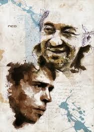
florian nicolle
i really like florians technique as i feel he's figurative illustrations portray a personality.
the collage effects also creates texture to clothes and skin.
Tuesday, 10 December 2013
Shirley Hughes
i think these children's book illustrations by shirley hughes are beautiful and nostalgic, i like how they are realistic yet still have defined character style. i think the illustrator has given her characters a loveable quality . i would like to try out and experiment with character design, i think Shirley's approach to creating characters is a approach i would want to achieve- detailed realistic figures with a stylised touch.
Subscribe to:
Comments (Atom)


